Back تايمز نيو رومان Arabic Times New Roman Azerbaijani Times New Roman BE-X-OLD Times New Roman Catalan Times New Roman Czech Times New Roman Danish Times New Roman German Times New Roman Esperanto Times New Roman Spanish Times New Roman Basque
 | |
| Category | Serif |
|---|---|
| Classification | Transitional Old-style |
| Designer(s) | Stanley Morison Victor Lardent |
| Commissioned by | The Times |
| Foundry | Monotype |
| Date released | 1932[1] |
| License | Proprietary |
| Design based on | Plantin |
| Metrically compatible with | Tinos |
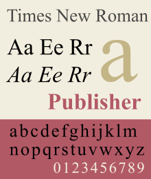
Times New Roman is a serif typeface commissioned for use by the British newspaper The Times in 1931, but has now become one of the most popular typefaces of all time and is installed on most personal computers. The typeface was conceived by Stanley Morison, the artistic adviser to the British branch of the printing equipment company Monotype, in collaboration with Victor Lardent, a lettering artist in The Times's advertising department.
Asked to advise on a redesign, Morison recommended that The Times change their text typeface from a spindly nineteenth-century face to a more robust, solid design, returning to traditions of printing from the eighteenth century and before. This matched a common trend in printing tastes of the period. Morison proposed an older Monotype typeface named Plantin as a basis for the design, and Times New Roman mostly matches Plantin's dimensions. The main change was that the contrast between strokes was enhanced to give a crisper image. The new design made its debut in The Times on 3 October 1932. After one year, the design was released for commercial sale. In Times New Roman's name, Roman is a reference to the regular or roman style (sometimes also called Antiqua), the first part of the Times New Roman family to be designed. Roman type has roots in Italian printing of the late 15th and early 16th centuries, but Times New Roman's design has no connection to Rome or to the Romans.
The Times stayed with the original Times New Roman for 40 years. The paper subsequently has switched typefaces five times between 1972 and 2007 to different variants of the original due to new production techniques and a format change from broadsheet to tabloid in 2004.
- ^ Clarke, C.F.O. (1946). "The Times: A Revolution in Newspaper Printing". Graphis. pp. 362–375. Archived from the original on 27 February 2021. Retrieved 15 December 2016.